We have all been there. You finish cleaning a dataset, you open your charting tool, and then you freeze. Should this be a scatter plot? A line chart? Both options are right there, both look reasonable, and both will produce something your manager will nod at.
But here is the uncomfortable truth: picking the wrong one between a scatter plot and a line chart can quietly lie about your data. Your audience will not notice, you might not notice, and a decision will get made on a chart that was technically wrong.
I have made this mistake. More than once. So let us break down the scatter plot vs line chart debate the way I wish someone had explained it to me on day one - with plain language, real examples, and the small details that actually matter.
The short answer
If you only read one line of this post, read this one.
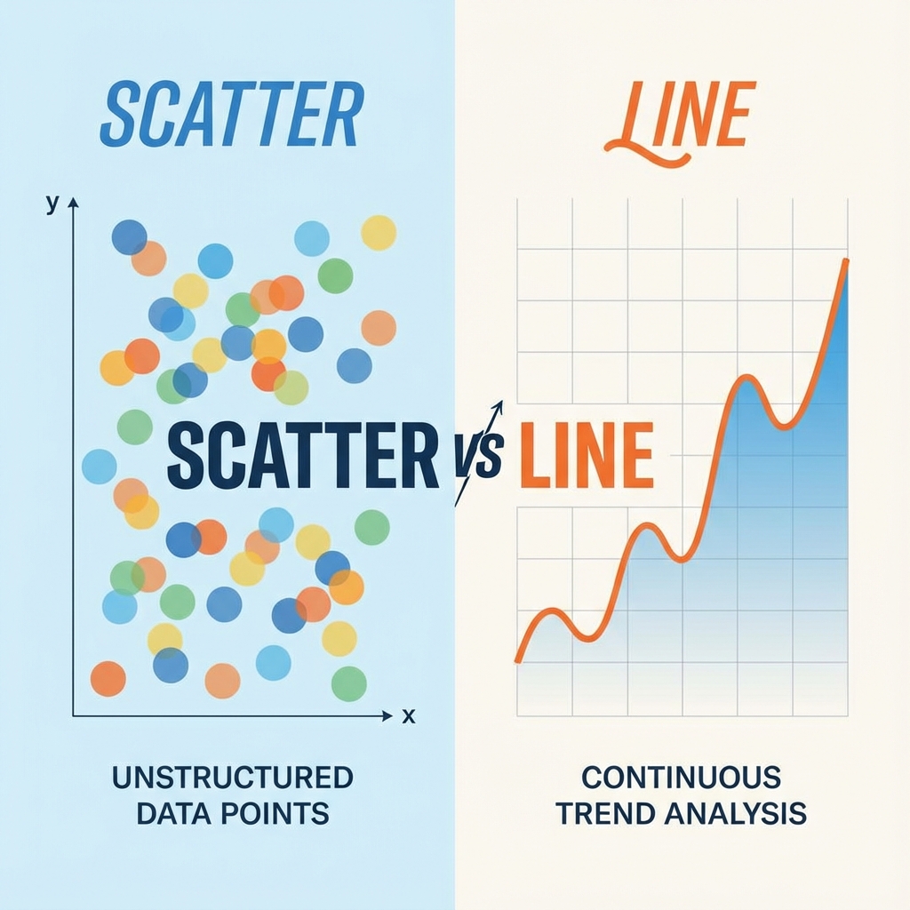
Use a line chart for change over time. Use a scatter plot for relationships between two variables.
That is the rule. Everything below is the why, the nuance, and the edge cases that trip people up.
What is a line chart, really?
A line chart connects data points with a continuous line. The connection is not just a visual choice, it is a statement. It says, “these points belong to the same story, and the order matters.”
When you draw a line from January to February, you are telling your reader that something traveled from one value to the next. Sales went up. Temperature went down. Traffic doubled. The line itself is part of the message.
That is why line charts feel so natural for time series data. Time has a direction. It moves forward. The line moves with it.
When a line chart is the right choice
- ·Stock prices over a trading day, week, or year
- ·Website traffic by hour or day
- ·Monthly revenue trends
- ·Temperature readings across seasons
- ·User signups week over week
- ·Mathematical functions like a sine wave or growth curve
When a line chart quietly lies
Line charts get misused all the time, usually because they look clean and the tool offers them by default. A few classic traps:
- ·Categorical X-axis. Connecting “Apples, Bananas, Oranges” with a line implies a transition that does not exist. Use a bar chart.
- ·Unordered observations. Plotting ten students by ID and connecting them invents a journey that was never there.
- ·Huge gaps in time. One point in 2020 and the next in 2025 connected by a straight line pretends nothing happened in between.
- ·Five spaghetti lines on one chart. That is not a chart, it is a puzzle.
What is a scatter plot, really?
A scatter plot drops each data point as an independent dot on a 2D plane. No lines. No assumed order. Just a cloud of observations.
That cloud is the whole point. Scatter plots are honest in a way line charts are not. If your data has no relationship, the cloud looks random and you know to stop pretending. If there is a strong correlation, the cloud forms a clear shape and the story tells itself.
“Scatter plots are the detective of the chart family. They do not assume anything. They wait for the pattern to reveal itself.”
When a scatter plot is the right choice
- ·Correlation analysis between two variables (height vs weight, ad spend vs revenue)
- ·Cluster detection to find natural groups in your data
- ·Outlier hunting to spot the one weird point that does not fit
- ·Experimental data where each row is an independent measurement
- ·Survey results where each respondent is a separate dot
When a scatter plot falls flat
- ·Too few points. Under ten and the pattern is too sparse to read.
- ·Genuine time-series. If you want to show a trend, not individual events, switch to a line.
- ·Massive overplotting. Every dot blends into one giant blob - fix with transparency or a hexbin plot.
The side-by-side cheat sheet
This is the comparison I keep open in a sticky note when I am building dashboards.
| Question | Line chart | Scatter plot |
|---|---|---|
| Is the X-axis time or ordered? | Yes, almost always | Not necessarily |
| Are points connected in sequence? | Yes, that is the point | No, each dot stands alone |
| Best for showing trends over time? | Yes | Only with a trendline |
| Best for showing relationships? | Rarely | Yes, this is its strength |
| Good for spotting outliers? | Hard, they hide in the line | Excellent, they jump out |
| Handles thousands of points? | Gets messy fast | Yes, with transparency |
Still on the fence? Ask yourself: would removing a random data point break the story? If yes, line chart. If no, scatter plot.
A real example: same data, two stories
Let us look at a dataset that gets visualized wrong all the time. Imagine you are studying the relationship between hours studied and test scores for a class of students.
import matplotlib.pyplot as plt

# Each entry is a different student
hours = [1, 2, 2.5, 3, 5, 6, 7, 8.5]
scores = [50, 60, 65, 70, 85, 88, 92, 95]

fig, axes = plt.subplots(1, 2, figsize=(12, 5))

# Wrong: implies one student progressing over time
axes[0].plot(hours, scores, marker='o', color='steelblue')
axes[0].set_title("Line Chart: Misleading")
axes[0].set_xlabel("Hours Studied")
axes[0].set_ylabel("Test Score")

# Right: shows independent students and their relationship
axes[1].scatter(hours, scores, color='coral', s=80, edgecolors='darkred')
axes[1].set_title("Scatter Plot: Honest")
axes[1].set_xlabel("Hours Studied")
axes[1].set_ylabel("Test Score")

plt.tight_layout()
plt.show()
Look closely at the two charts. The line version makes it look like a single student studied for one hour, then two hours, then three, getting smarter at each step. That story is fiction. These are eight different students.
The scatter plot tells the truth: more study time tends to correlate with higher scores, but each dot is its own person.
This is exactly the kind of subtle distortion the wrong chart introduces. The numbers are identical. The implications are completely different.
What about combining both?
Here is a fun secret most beginners miss. You do not have to pick just one. A scatter plot with a fitted trendline gives you the best of both worlds. Each observation stays honest as its own dot, and the line on top summarizes the overall pattern.
This is the format you see in most scientific papers, regression analyses, and serious dashboards. It admits the messiness of real data while still pointing out the trend. If you are presenting findings to a non-technical audience, this combo is almost always more persuasive than either chart alone.
Frequently asked questions
Is a scatter plot or line chart better for time series data?+
Can I use a scatter plot for time-based data?+
What is the difference between a line graph and a scatter plot in math class?+
Why do scatter plots use dots instead of lines?+
How many data points do I need for a scatter plot to be useful?+
The one question to ask before you pick
Forget rules for a second. Next time you are about to choose between a scatter plot and a line chart, ask yourself this:
“Am I telling a story that moves through time, or am I revealing a relationship between two things?”
A story that moves through time → line chart. A relationship between two variables → scatter plot.
Get that one decision right and you will save yourself from ninety percent of the chart mistakes that quietly mislead audiences. Your data deserves the right canvas, and now you know which one to grab.
Build your scatter plot in seconds - free, no signup.