Statistics
May 20, 2026
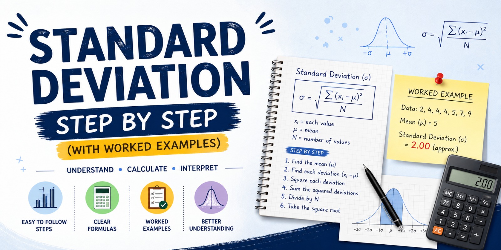
How to Calculate Standard Deviation Step by Step (With Worked Examples)
A plain-English walkthrough of standard deviation. Two full worked examples, the population vs sample trap, and the small detail that ruins most homework answers.
Read Article