Last week a friend messaged me asking how to make a scatter plot in Google Sheets. She had tried following the Google support docs but ended up frustrated. The chart looked weird, the labels were wrong, and she had wasted an hour.
Sound familiar? Yeah, me too. When I first started, I thought Sheets charts were just... bad. But after using them for years, I have figured out the tricks that actually work. Here is my honest walkthrough using real advertising data.
The Data We Are Working With
For this tutorial, I am using a dataset with 100 rows of advertising budget and sales revenue data. This is the kind of real-world scenario you might actually encounter: trying to see if there is a relationship between how much you spend on ads and how much revenue you generate.
You can download the CSV file and follow along.
Here is what the raw data looks like in Google Sheets:
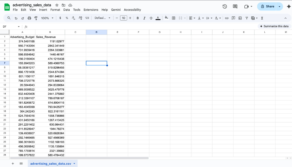
Two columns: Advertising_Budget and Sales_Revenue. Simple, clean, ready to analyze.
Step 1: Select Your Data
Before creating any chart, you need to select your data properly. This is where most people mess up.
Click on cell A1, then hold Shift and click on the last cell with data (in my case, B101). You should see both columns highlighted like this:
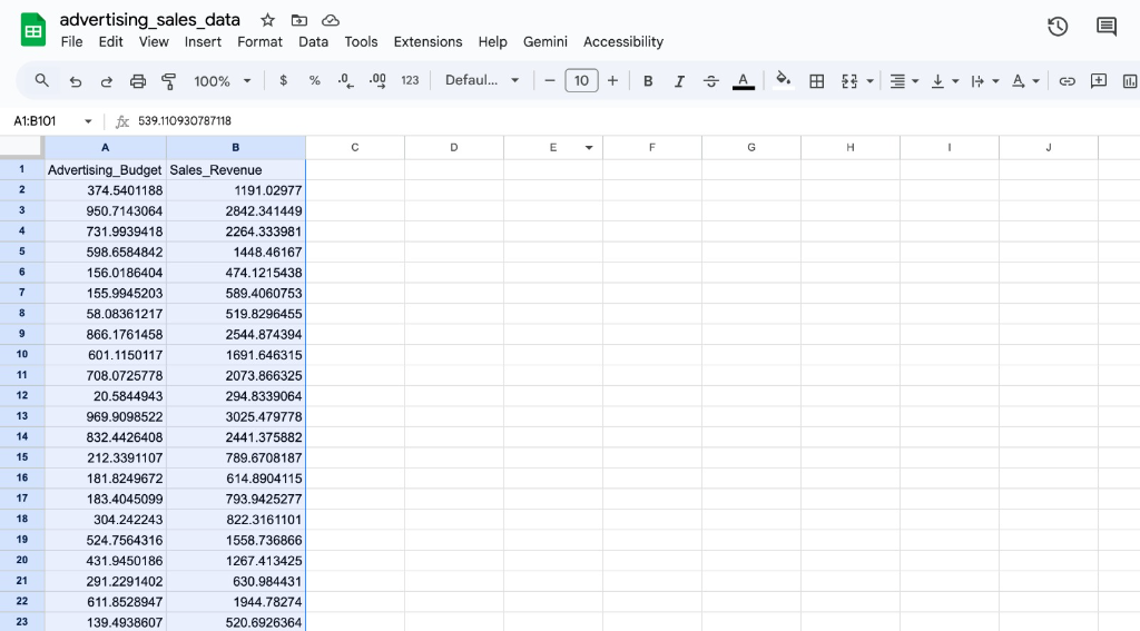
Notice in the formula bar it shows the range A1:B101. This tells Sheets exactly what data to use for the chart.
Pro tip: Make sure your headers are included in the selection. Sheets uses them to label your axes automatically.
Step 2: Insert the Chart
With your data selected, go to the Insert menu and click Chart.
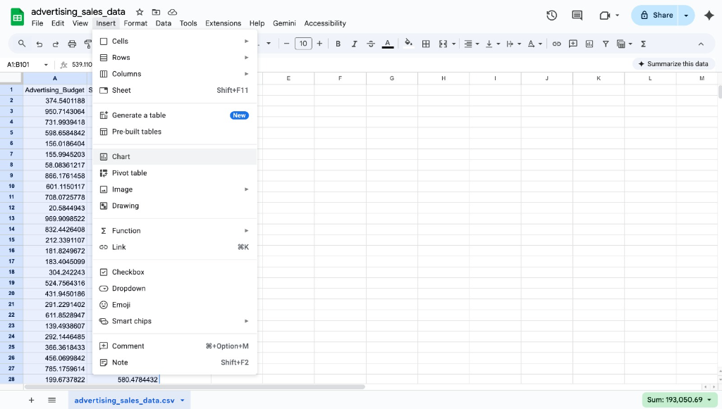
Here is where most people get confused: Sheets will probably give you a bar chart or something random. Do not panic.
In the Chart editor panel on the right, find the Chart type dropdown. Scroll down until you see Scatter chart. Click it.
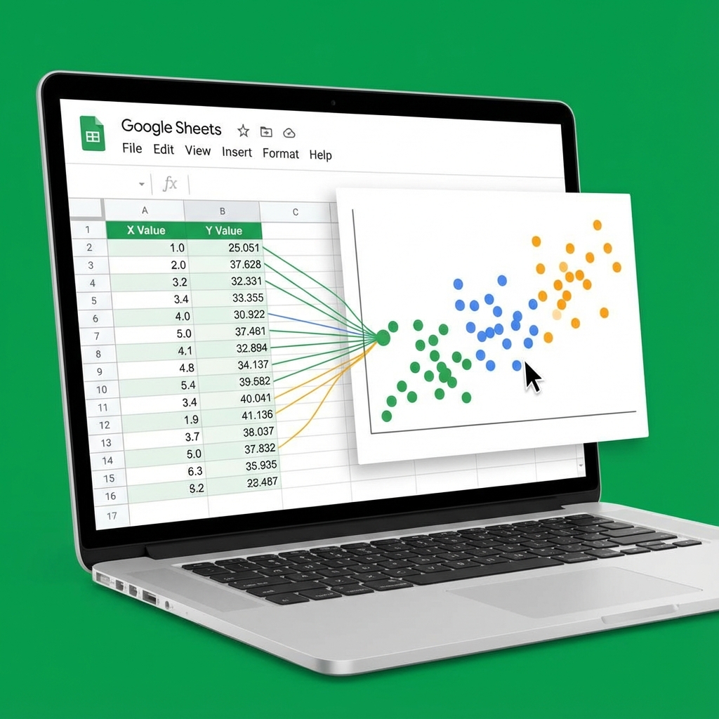
Step 3: See Your Scatter Plot Come to Life
Once you select Scatter chart, your data transforms into something actually useful:
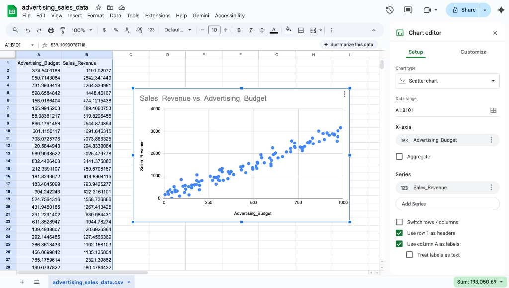
Look at that. You can immediately see there is a strong positive relationship between advertising budget and sales revenue. The more you spend on ads, the higher the revenue. This is exactly the kind of insight scatter plots are designed to reveal.
Notice in the Chart editor panel:
- X-axis is set to Advertising_Budget
- Series is set to Sales_Revenue
- The checkboxes for "Use row 1 as headers" and "Use column A as labels" are checked
Step 4: The Customization That Actually Matters
The default scatter plot looks okay, but you can make it better. Here are the tweaks I always make:
Chart and axis titles: Click on the Customize tab, then Chart and axis titles. I renamed mine to something clearer like "Ad Spend vs Revenue Analysis" instead of the auto-generated title.
Point color: Under Series, you can change the point color. I usually pick something that contrasts well with white: navy blue, dark teal, or a muted orange.
Point size: This is hidden but important. In the same Series section, increase the Point size slider until the dots are clearly visible.
Gridlines: Go to Gridlines and ticks. I usually turn off minor gridlines because they add visual noise without adding clarity.
Step 5: Adding a Trendline
In the Customize tab under Series, scroll down to find the Trendline checkbox. Turn it on.
Sheets will add a linear trendline by default. With this advertising data, the trendline clearly shows the positive correlation.
Here is my rule: only add a trendline if the R-squared value is above 0.5. You can show the R-squared value by checking the "Show R²" box. For this dataset, the R² is quite high, meaning the trendline actually represents the data well.
Step 6: Download or Embed
Once you are happy with the chart, click the three dots in the corner. You can:
- Copy it to paste into Google Docs or Slides
- Download it as PNG or PDF
- Publish it to the web as an embedded iframe
For presentations, I always download as PNG at the highest resolution available.
The Real Talk on Google Sheets Charts
Google Sheets is not the best tool for scatter plots. It is serviceable. For quick analysis or sharing with teammates, it works fine. But if you are building anything for a report, a paper, or a client presentation, consider using a dedicated tool.
Our scatter plot maker is designed specifically for this. You paste your data, customize everything in one place, and download publication-ready images. No battling with menus that hide options three clicks deep.
Common Problems and Fixes
The chart is blank: Your data range probably includes empty cells. Manually select just the cells with actual data.
Points are on a single vertical line: Your X values might be formatted as text instead of numbers. Check for leading spaces or apostrophes.
Labels overlap: Google Sheets is bad at this. Your best bet is to reduce the number of data points or use a dedicated tool that handles label collision better.
Cannot find scatter chart type: Scroll down in the chart type menu. It is at the bottom, not the top.
Wrapping Up
Google Sheets scatter plots are fine for quick internal work. With real data like this advertising dataset, you can quickly spot trends and correlations without writing any code.
Just remember to clean your data first, pick meaningful titles and labels, and do not force a trendline where none belongs.
For anything beyond basic analysis, you will hit limitations fast. The export quality is mediocre, advanced customization is buried in menus, and the default styling looks dated.
But for a free tool that everyone already has access to, it gets the job done. Now you know how to make it work.
Build your scatter plot in seconds - free, no signup.